HAPPY THURSDAY, EVERYONE! IT’S WEEK 6!!!!!! We can’t believe we’ve made it!  These past weeks have been insane here at RAD, but we’re so glad we decided to participate in the One Room Challenge! We’d like to thank Linda for creating this amazing event! We’ve learned it is about so much more than designing a room in a short amount of time: it is about fostering community. It has been so great to share our work, but even more so to see what the other participants have been working on, and to know that we’re all working toward the same goal and encouraging each other as we go along. This has been a very special experience, and we’re glad we got to be a part of it!
Okay, let’s go through a quick recap. If you want a more detailed recap, feel free to go to our previous One Room Challenge posts:
Week 1/ Week 2/ Week 3/ Week 4/ Week 5
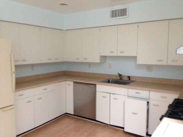
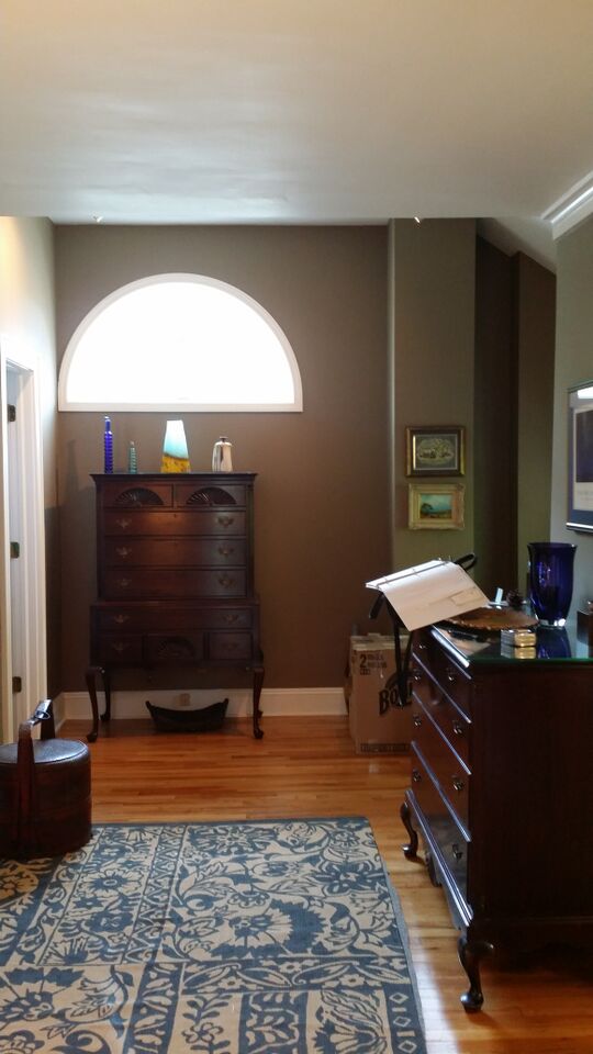
The room used to be a separate kitchen and dining room, and it was such a tight space that it was difficult to get a before shot. So this a not-so-great before shot.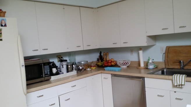
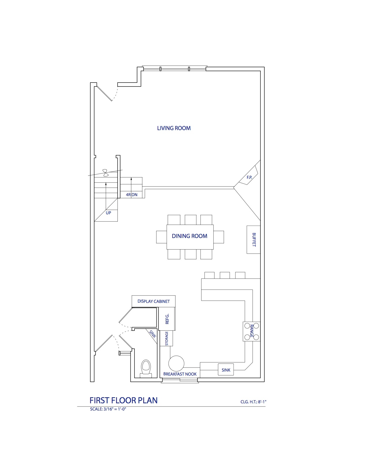
And then we decided to knock down the wall separating the kitchen and dining room, transforming it into one big room. This was the plan:
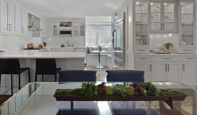
With everything in red in this floor plan gone, we had the space to transform it into this: 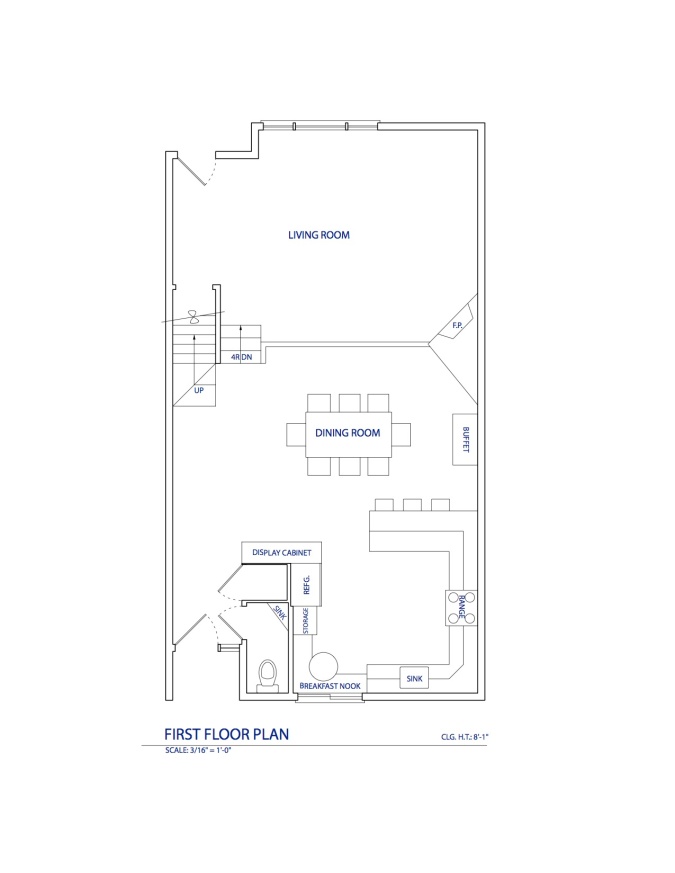 And now it looks like this!
And here are a couple of before and after shots from similar angles so you guys can see the transformation:
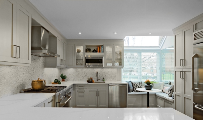
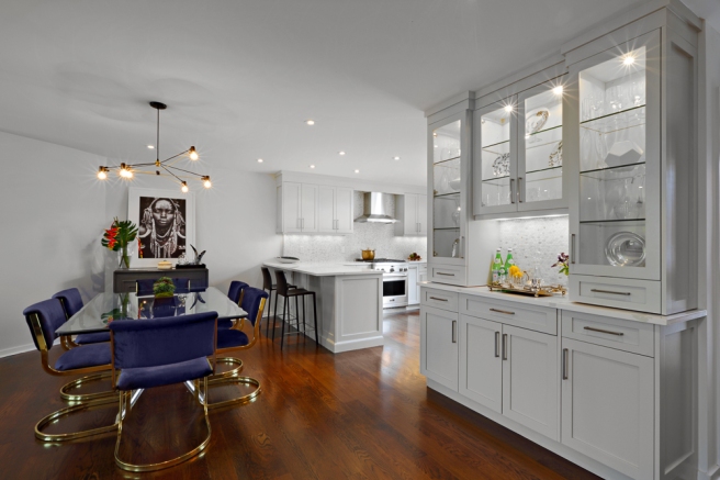
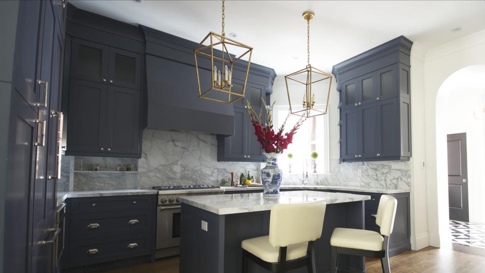
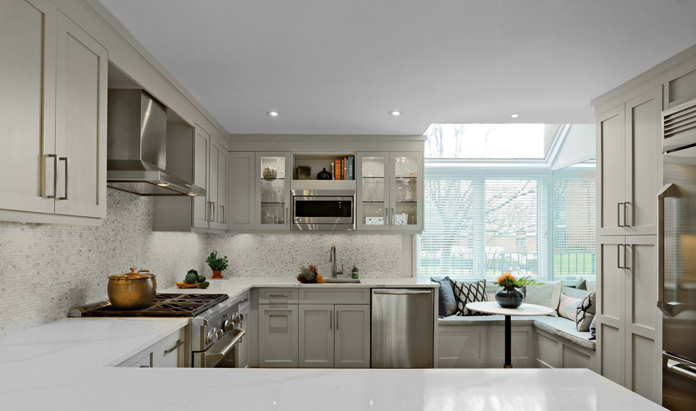
With the wall on the left gone, we decided to add a peninsula to create some extra counter space, storage, and seating.
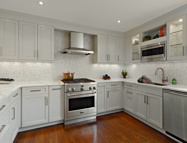
We wanted the client to have a better view of the window from the sink, so we switched the sink and the stove. We also chose to do this because it makes the hood the main focal point in the kitchen.

And though these last two pictures aren’t from the same angle, they show how we opened the staircase to the rest of the room.
Crazy transformation, isn’t it?!?! We are so glad our clients were game to knock down that wall. It really makes a lot of difference. And we’re glad we moved that closet out of the way to the stairs. The walls around that closet took up so much space, and now the space is just open and it flows beautifully!
Now let’s tackle one area at a time, starting with the kitchen! Oh, and we’d like to apologize in advance for the few iPhone shots mixed in this. Hours after the photo shoot was over we kept thinking of great shots we should have taken, and so we went back Tuesday to get a few more shots.
Let’s get a closer look:

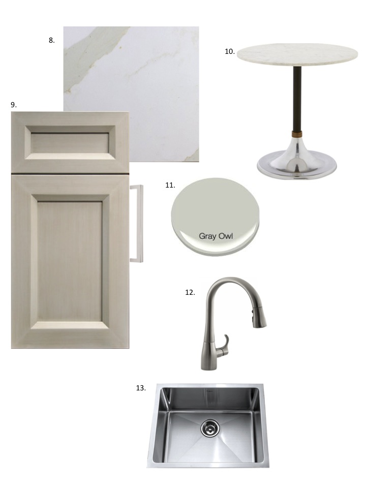
If you’ve been following us through this process, you know that we ran into a couple of setbacks with the countertop and the backsplash. And even though we had not designed this with the Calacatta Quartz or the mini bricks in mind, we could not be happier with the way this turned out!

We went with a beautiful stainless range and hood to keep it clean and simple.
We moved the sink to this side so that more natural light hit it during the day. And we added some open storage on top, so our clients could keep things like cookbooks in full view.

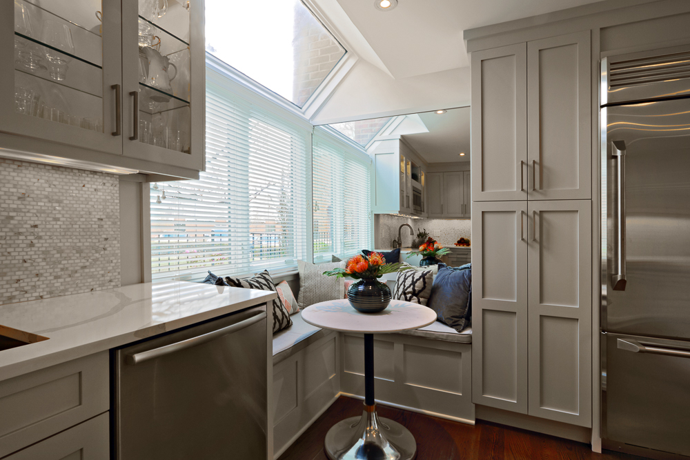
We LOVE the breakfast nook! We added a mirror behind it so it can reflect the natural light from the window into the rest of the room. It makes the room look so much brighter!
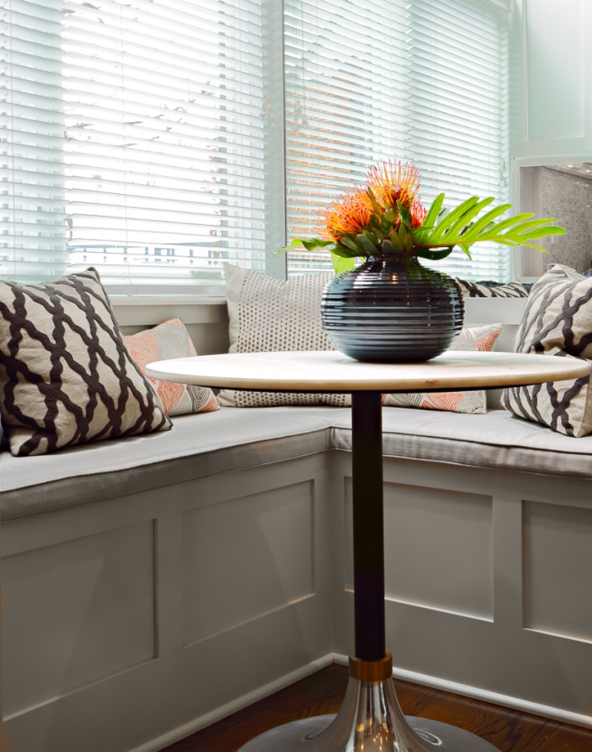
Another shot of the nook, just because we adore it!
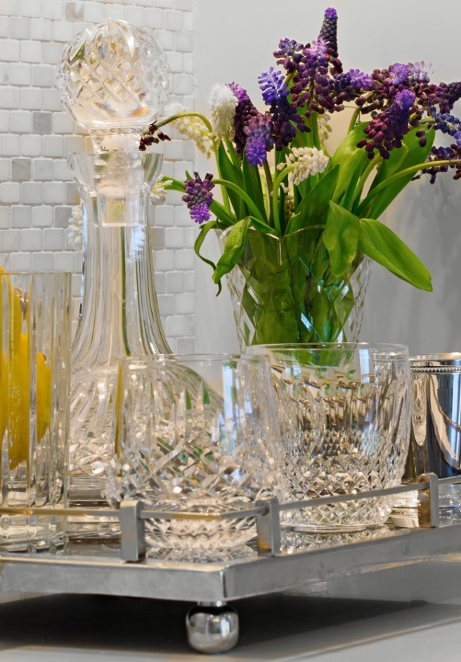
We chose a single door refrigerator because a double door one would take up valuable storage space, and our clients really need the storage space! And since we’re talking about storage:
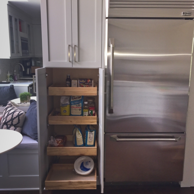
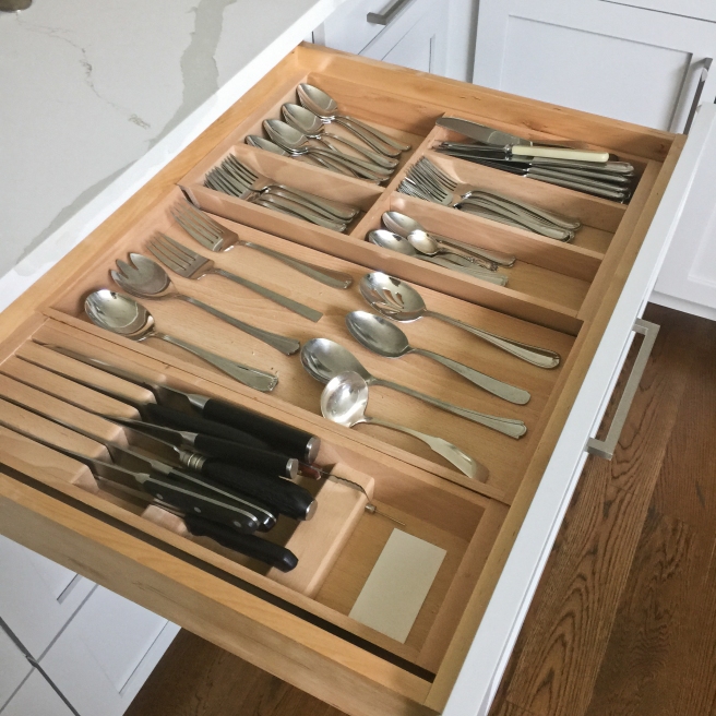
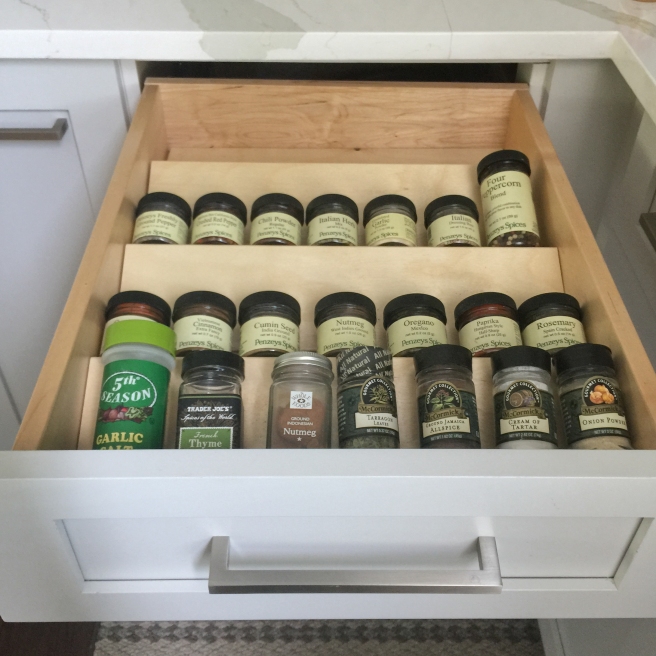
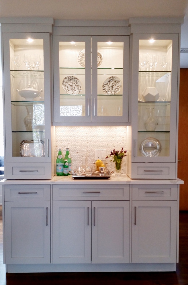
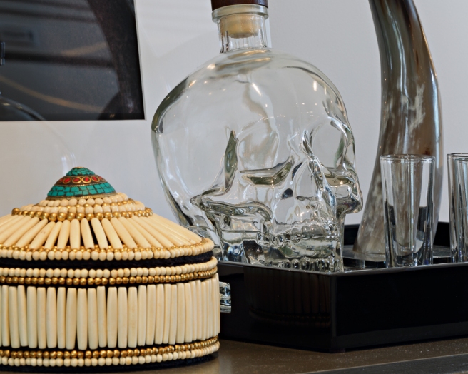
We added this hutch for more storage, and so our clients can display the beautiful things they’ve collected over the years.
We loved styling this area! Now let’s move on to the dining room!
And from the other side:

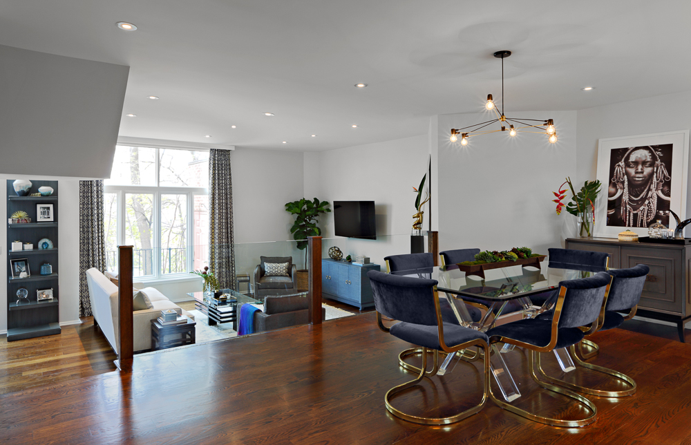
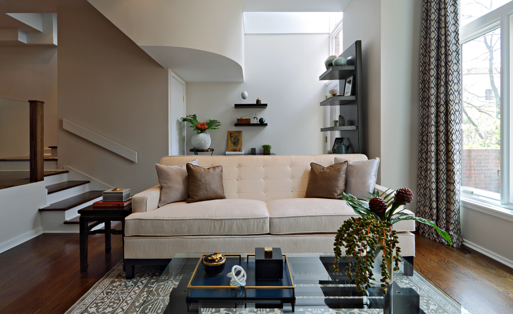
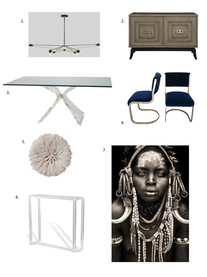
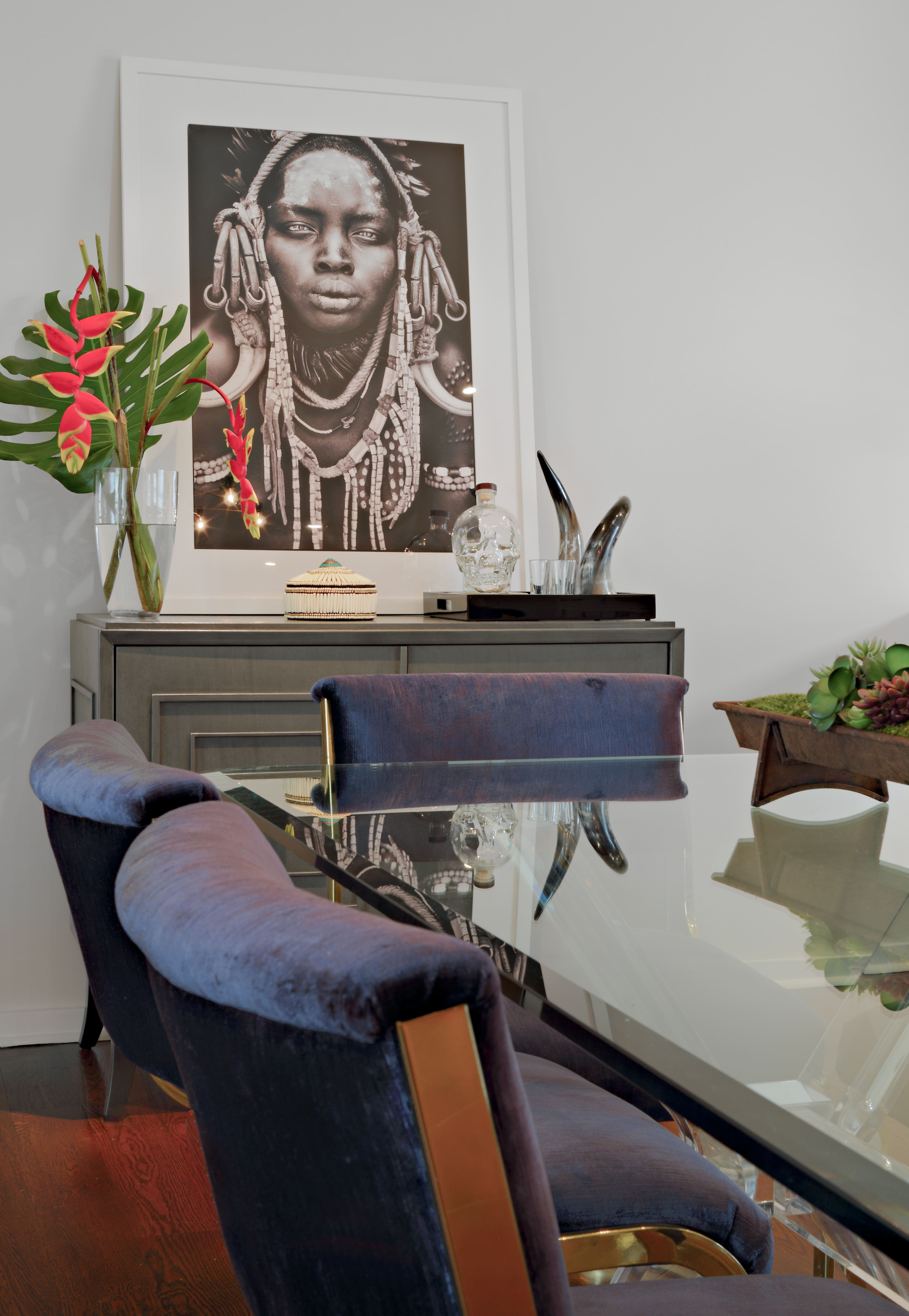
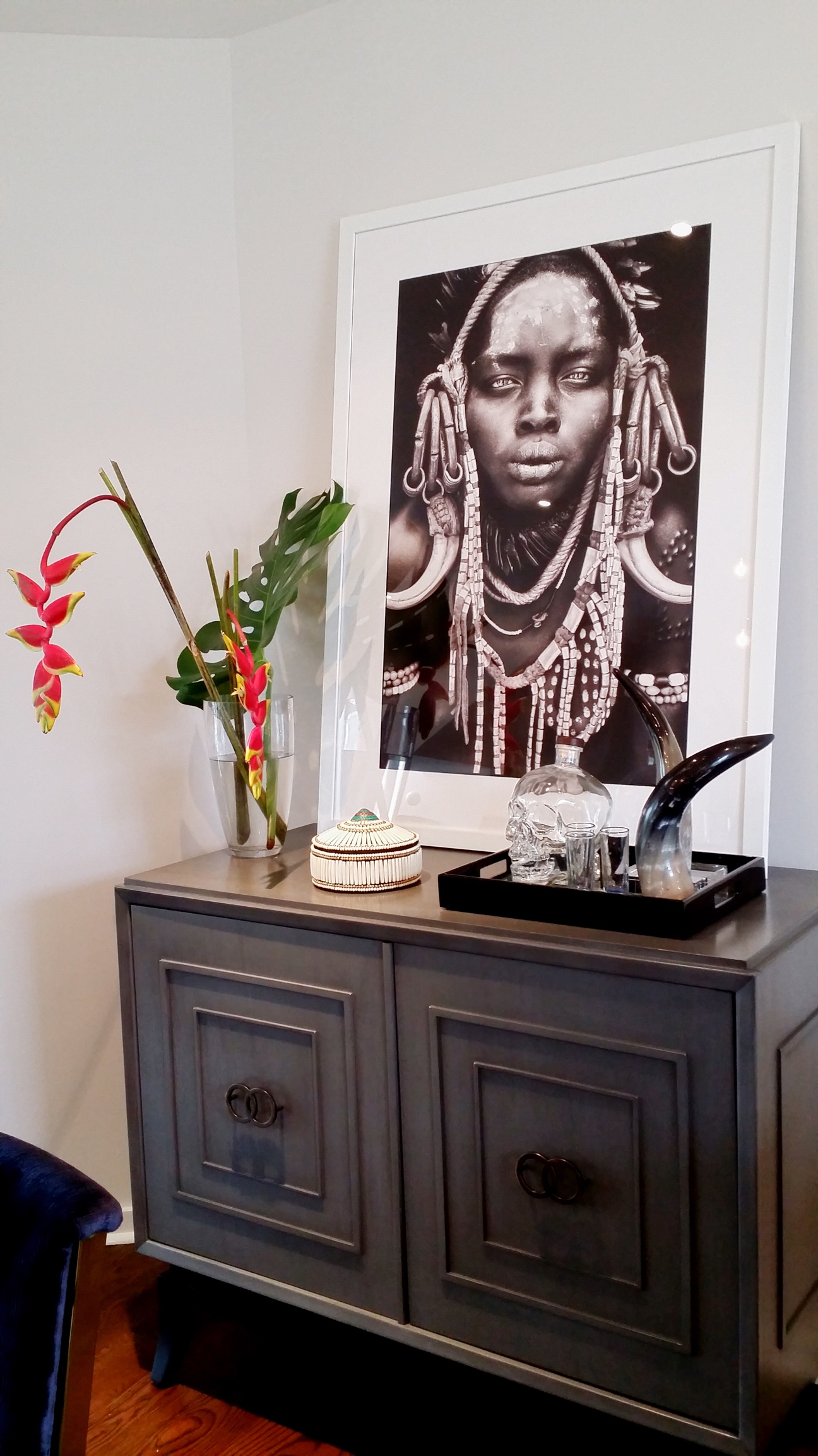
We still cannot get over this room! The table and chairs are absolute treasures! And the art with the Mursi girl just gives the room so much character!! It all works perfectly together!
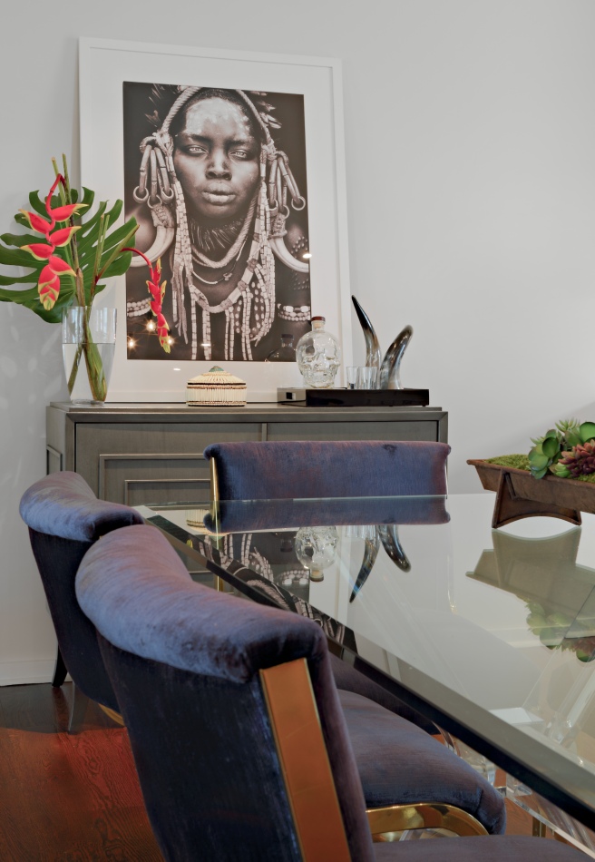
We were so lucky to find the Lucite table and gorgeous chairs on Etsy! The chairs had to be reupholstered, but they look perfect!
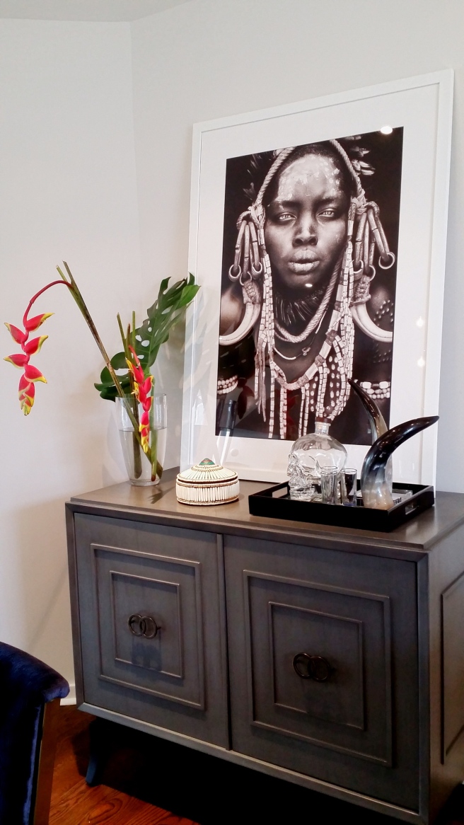
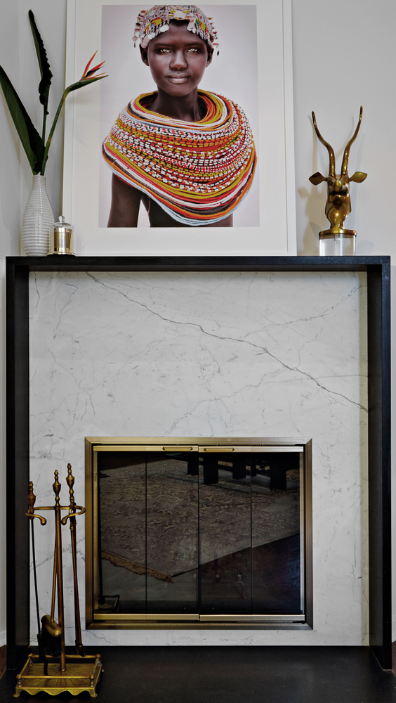
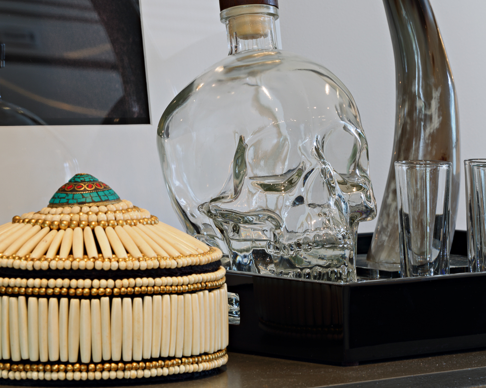
The buffet is perfect for added storage, and it anchors the stunning Mursi girl photograph by Mario Gerth. We went with a more subdued buffet so it would not compete with the art for attention. And the flowers seen here were absolutely worth the 5 a.m. trip to the flower district! We thought exotic flowers would accentuate the mood created by the art, and we were right!
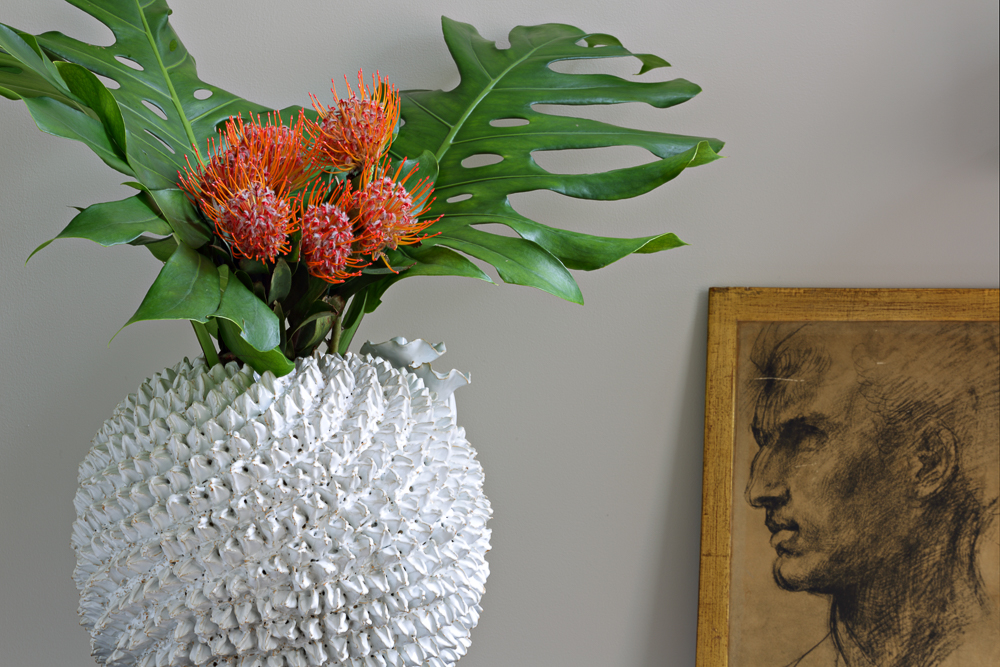
We added these for some styling, and they look wonderful! Now let’s move to the other side of the room:
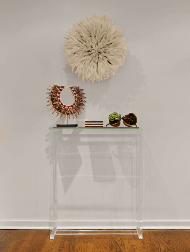
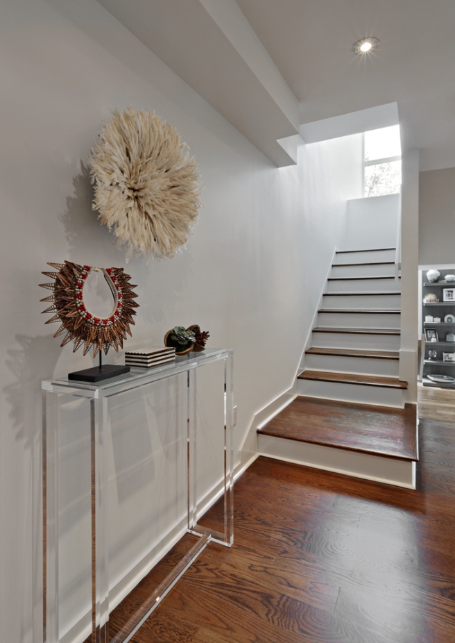
We really did not like how the stairs were previously blocked by the closet, and so we decided to make this side of the room as open as possible. We chose this Lucite console because we wanted a console there, but we still wanted for people to get a straight shot of the stairs when they walk through the door into the house. We chose to go with a light Juju hat because while it reinforces the exotic mood set by the art, it does not overpower the delicate Lucite console.
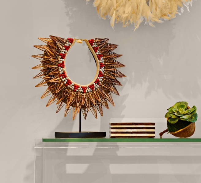
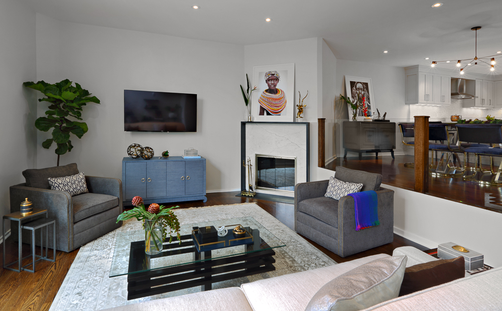
We styled this in a very simple way because we felt like the other side of the dining room should be the focal point. But we still love these pods and the box we used here. A couple of weeks ago we showed you guys the glass wall that divides the dining room and the living room. This is what that looks like now:

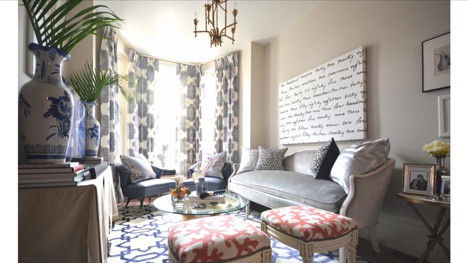
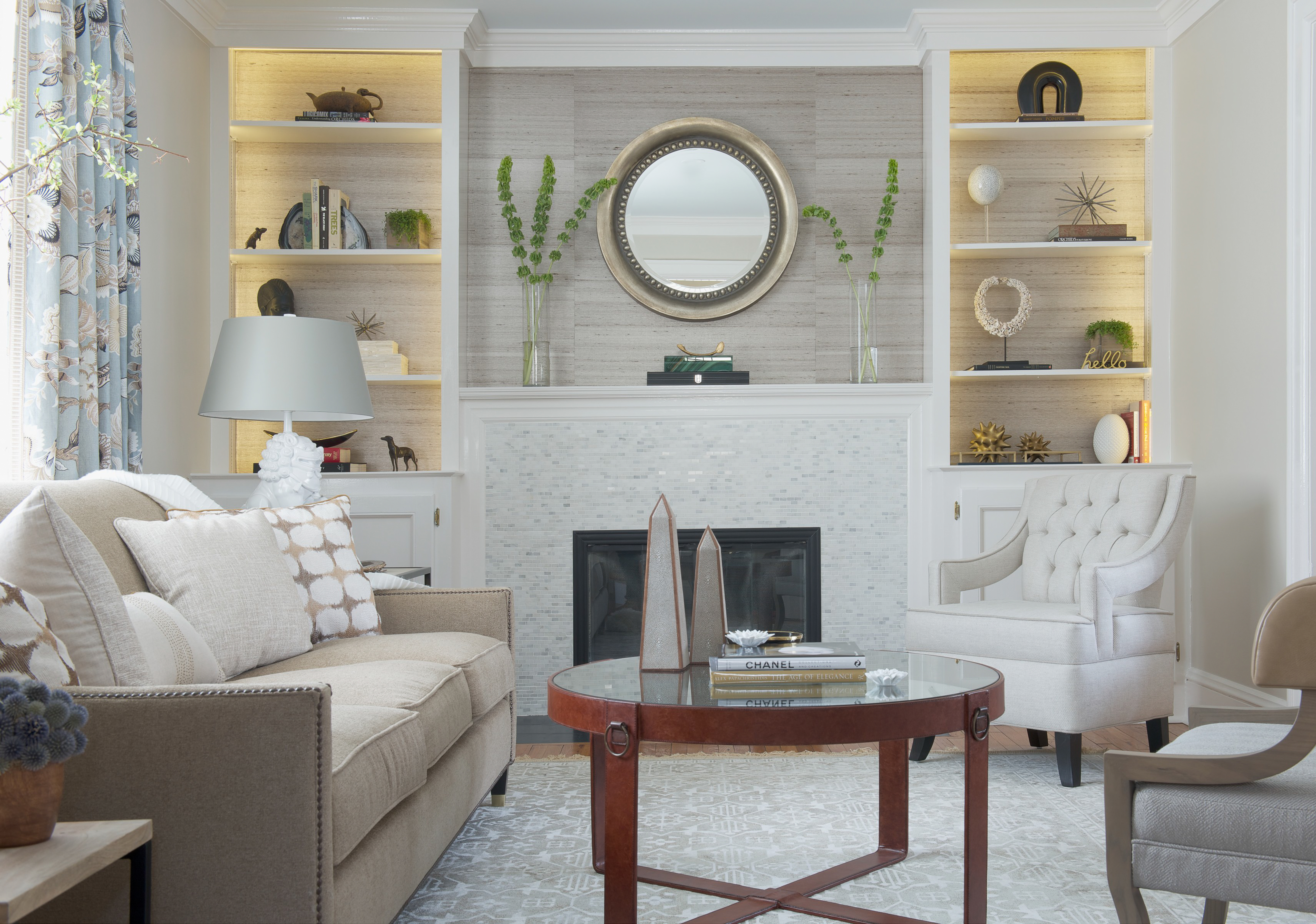
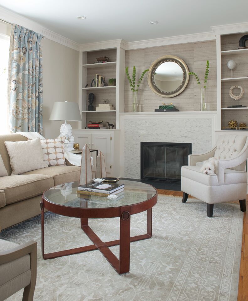
We did not include the living room in our One Room Challenge for two reasons: first, it would become a very big job, and second, we were not sure we would get that room done in time. We’re glad we did finish it in time, and that means we save our photographer a second trip! So if you want to see more of the living room, we will do a post on it next Thursday! And we’ll also share where we got a lot of the things we used in this project. Honestly, we were planning to do it today, but we ran out of time. But that gives you guys another great reason to check out next week’s post 🙂
Thank you for following us in this wonderful journey that is the One Room Challenge! And make sure to check out the reveals for the Wednesday participants and the other linking participants! Also, you can follow us not only here on AlwaysRAD, but also on Instagram and Facebook! 
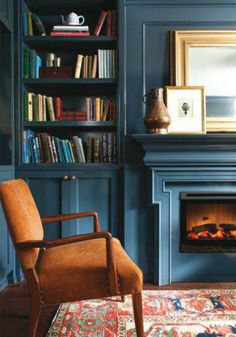
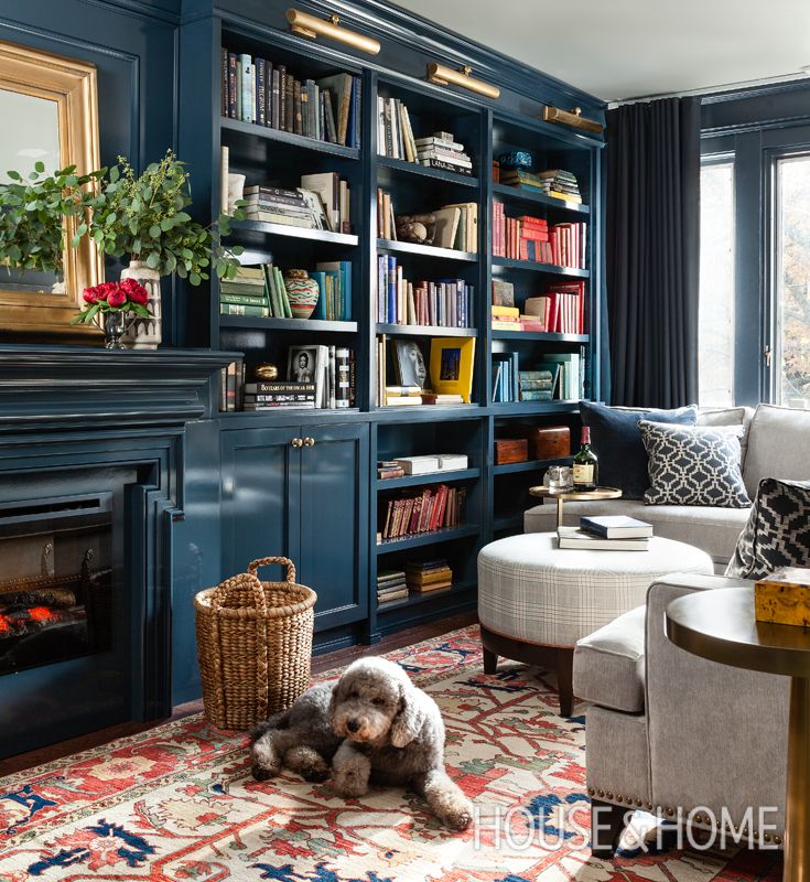
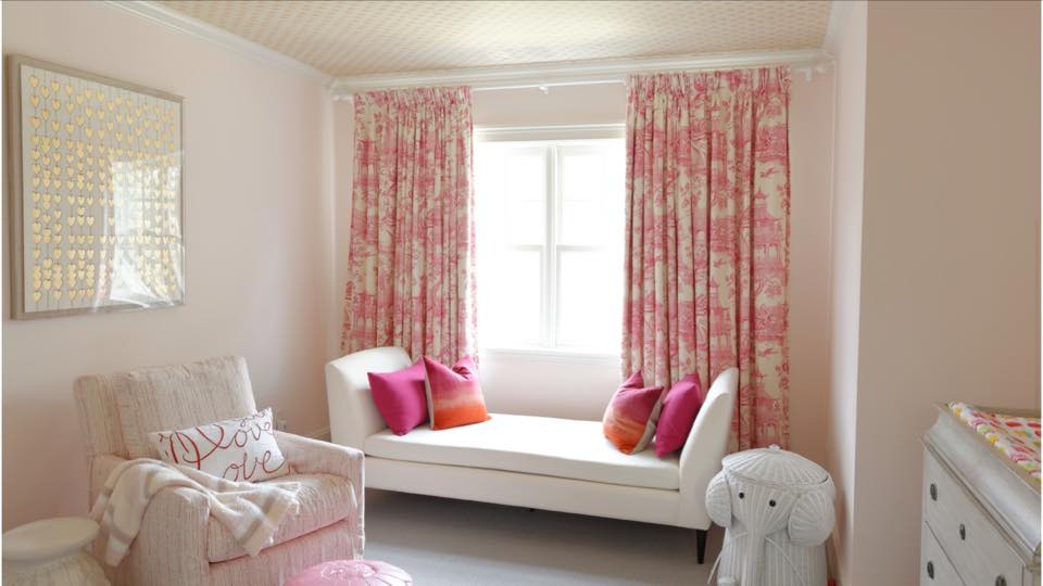
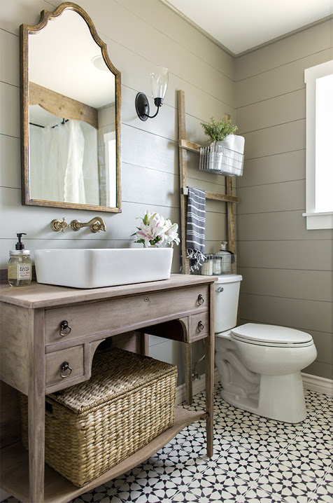
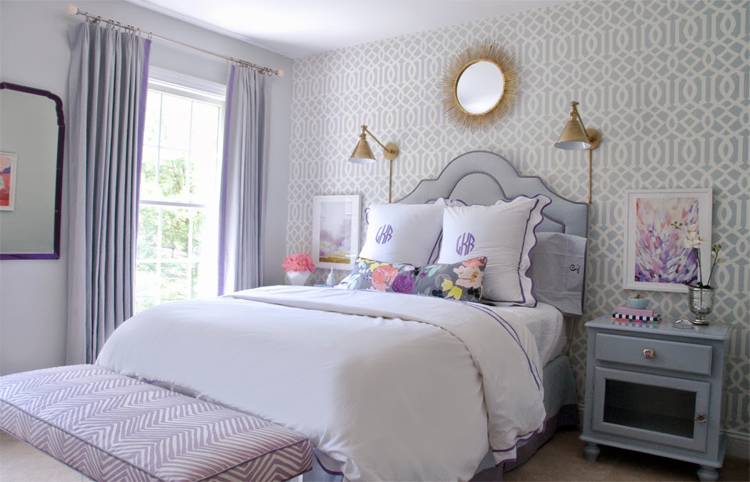
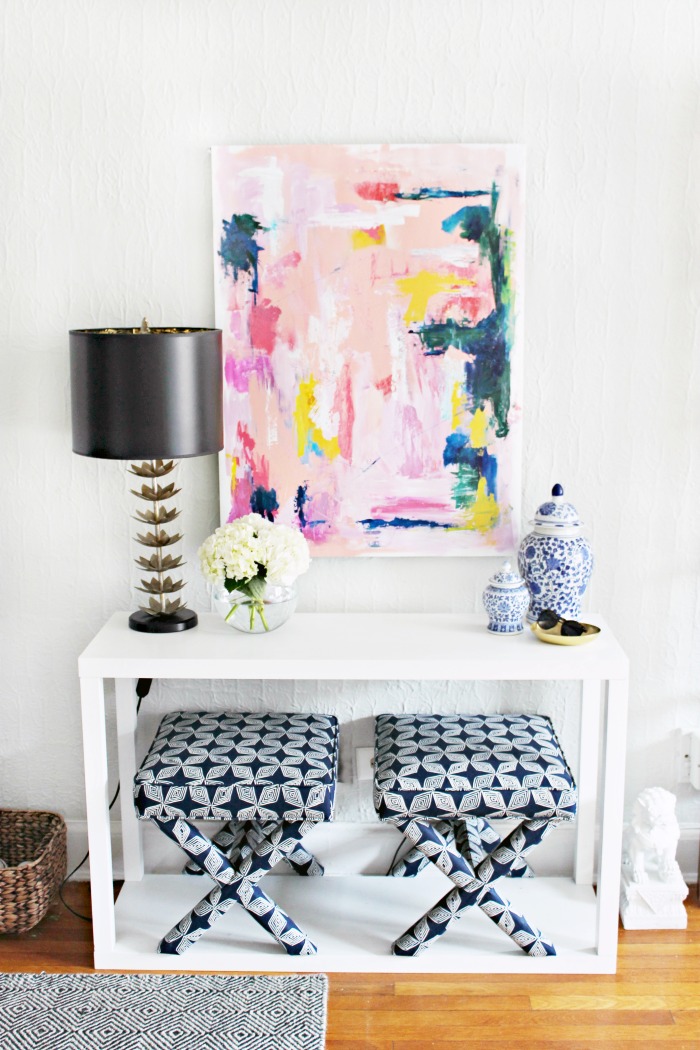
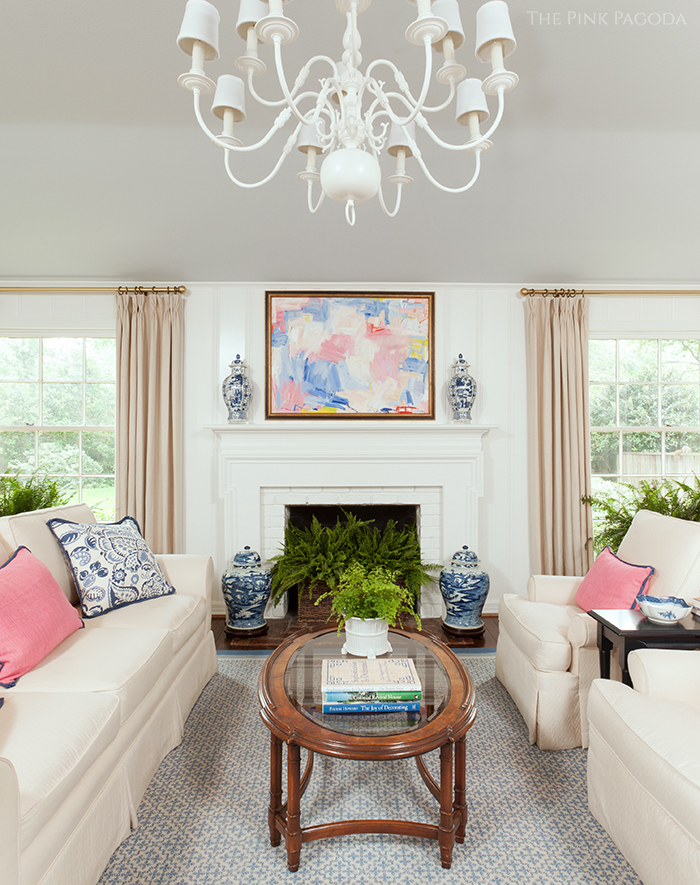
 We adore Meredith’s work, most particularly the way she creates really classic rooms, but manages to incorporate a lot of color into her designs.We love her smart use of patterns and the fact that she is able to mix different styles so effortlessly. Her work has been featured on both print media and on HGTV, as well as other TV channels. Also, you can check out her amazing fabrics collection here 🙂
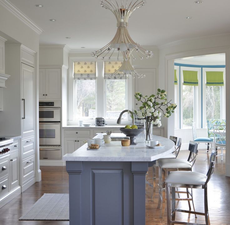


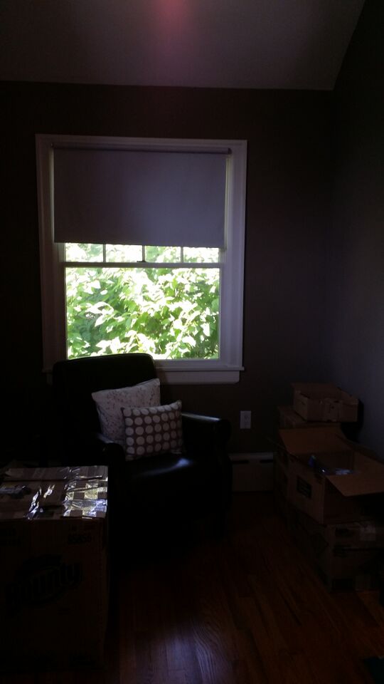
 Hi Everyone!

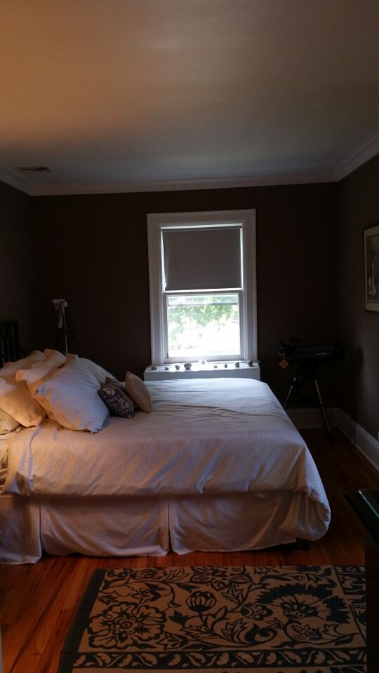
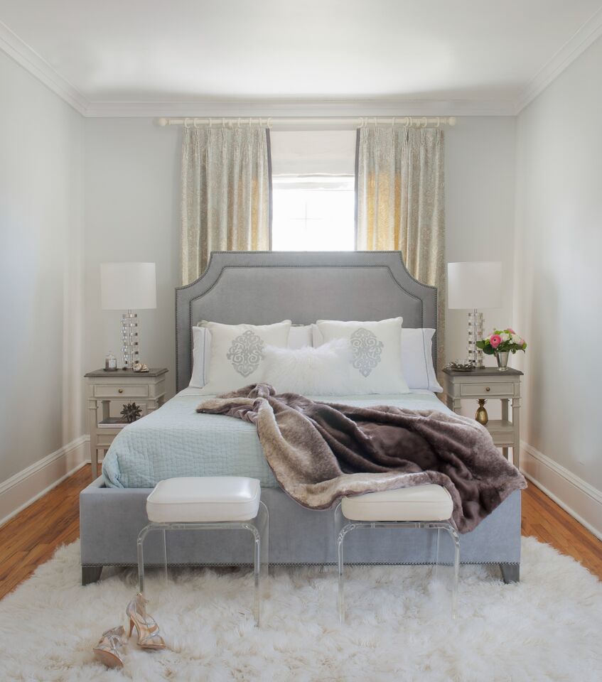
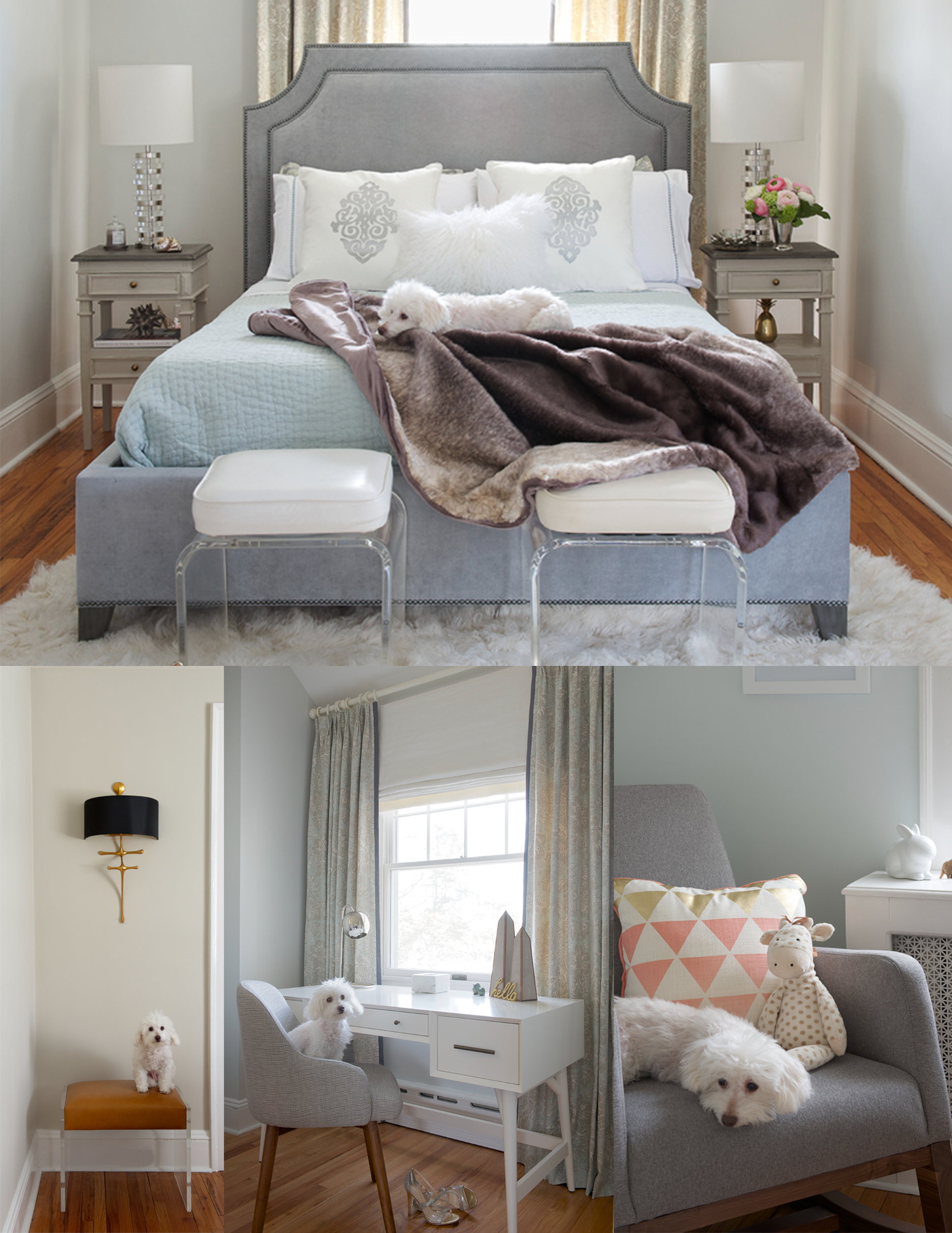
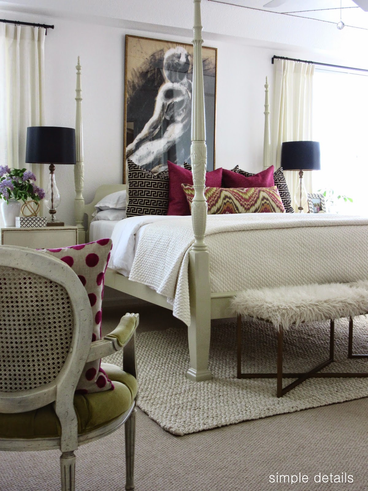
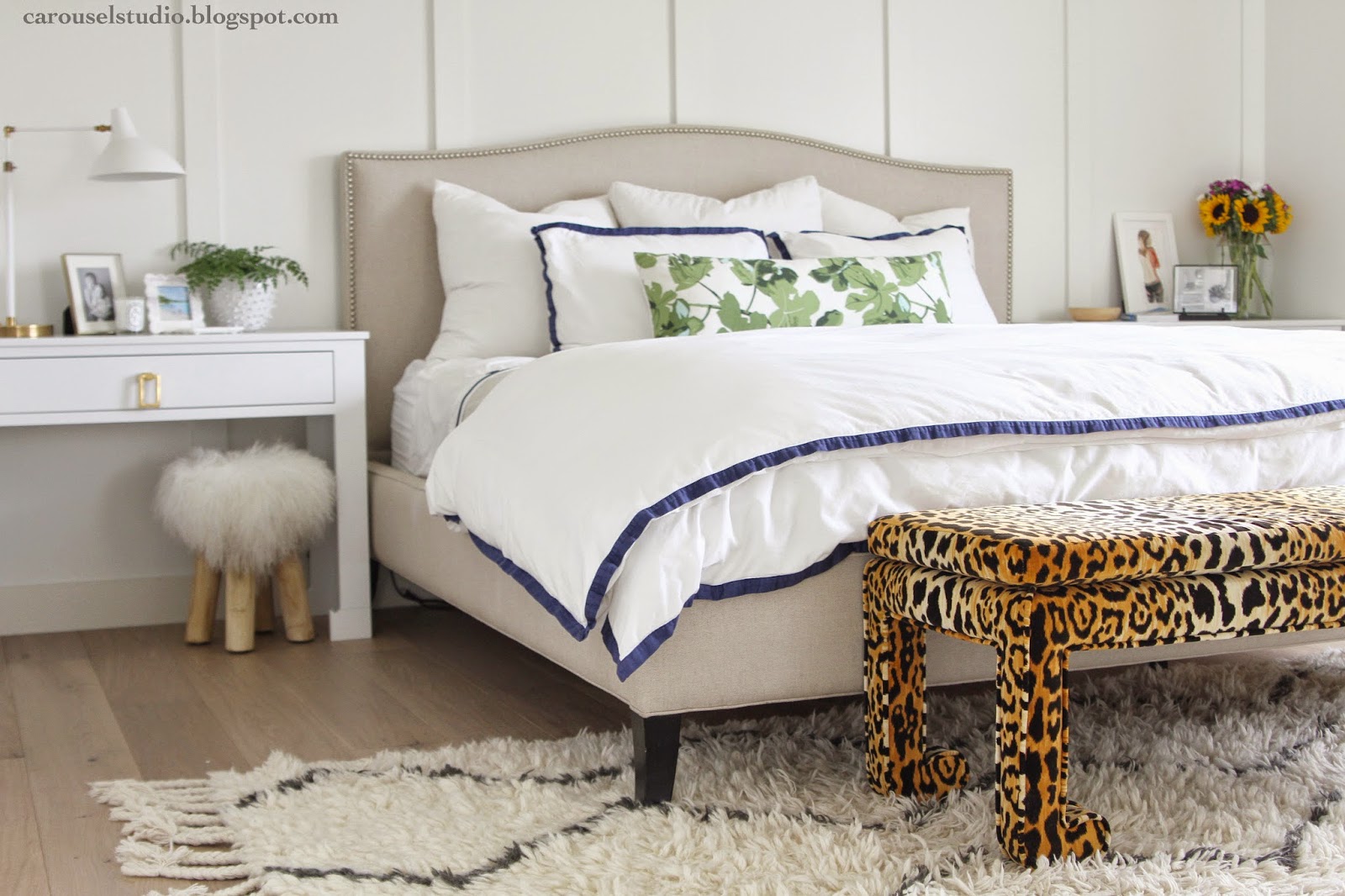
 Master Bedroom – After
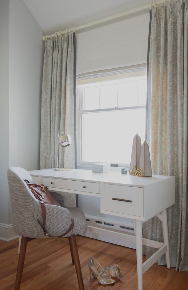


